Hello, World!
I had been thinking about the idea of having my own website and running my own services for a while. The reason for this is that I don't like the current state of the web and the way most people interact with it, and I strongly believe that it's important to be the owner of your own content.
For one reason or another I didn't build a personal website before, but not so long ago I found out about webrings (better late than never, I guess) and started browsing other people's sites, following their links. I got particularly interested in the simplicity and uniqueness of some of these sites, and the fact that their content feels genuine and honest, unlike what is usually seen in more popular places on the internet. This gave me enough motivation and inspiration to start working on my own site.
One of the decisions I had to make was choosing which tools to use for building it. There are many static site generators out there (Astro, Eleventy, Hugo, Jekyll, to name some). After a bit of reading I decided to go with Astro simply because it uses a syntax for markup that is very similar to JSX, which I am familiar with, and even though there's JavaScript/TypeScript in the source files, the build process can generate pages with no JavaScript at all. Time will tell if this was a good decision.

With the static site generator already chosen, I had to figure out how to structure and style the pages. I could have picked a base template/theme and changed the styles, but instead I decided to do it the hard way: write everything myself. Why? Because this gives me full flexibility in how the code is structured and how I want the pages to look like, and I can also learn more by doing things from scratch.
My initial approach to the page layout is simple: a sticky header with navigation links at the top, and the main page content below. This is okay for now, and if I need to make layout changes in the future I made sure to write the page components in such a way that it wouldn't be too complicated to refactor. I prefer to keep things simple while respecting the document semantics as much as I can.

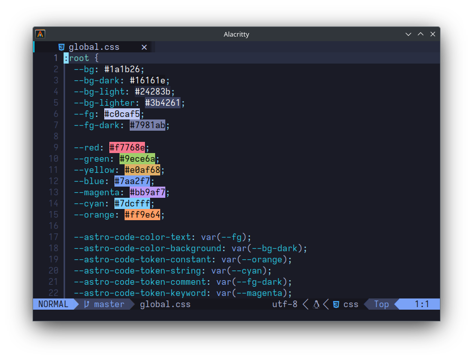
For styling, I chose the colors from the Tokyo Night Neovim color scheme and made slight changes to it to increase the contrast a bit. The Tokyo Night repo also has color configurations for other programs in the extras section.

At the time of writing this, the site doesn't have much content, but I'm relatively happy with the result because I finally got it working.